ShopDreamUp AI ArtDreamUp

Deviation Actions


Description
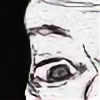
I have not drawn anything in quite a while. This is supposed to be Larry Mullen Jr. I don't think it looks very much like him, but I still like the way it came out.
H-7B pencils.
I used Photoshop to type in my name on the drawing and I don't have a scanner so when I took a picture of it, it came out dark so I lightened it up a bit, but other than that, no changes were made. This is how it looks in my sketchbook.
Here is the link to the photo I used as a source: [link]
Image size
2658x3555px 5.6 MB
Make
Canon
Model
Canon PowerShot SD1200 IS
Shutter Speed
1/30 second
Aperture
F/2.8
Focal Length
6 mm
ISO Speed
200
Date Taken
Sep 11, 2009, 8:12:28 PM
Sensor Size
4mm
© 2011 - 2024 popnhoney
Comments2
Join the community to add your comment. Already a deviant? Log In
Overall I say this is a good drawing. I see alot of potential in this. drawing,Especaily the eyes! There are a few things I will say, Too make your drawing,better. not on making it look like the person your drawing. I'll get too that later.
First off Is I feel like the face looks a little bit wide, then it needs too be, I think that would help your likeness of him, a little more, And I'd also work on the ear, because when the face looks wide, it makes the ear more akward looking.
Now, to the shading, overall you did a pretty good job! But I'll advise you too go a little darker with your shading and give the drawing more value. And more intresting and nice too look out, as for the shirt, I would of gone too a very dark pencil, and do the shirt, because the shirt looks kind of out of place with it's value. And the hair I can go on and on about. because hair is a difficalt subject too critique about. but for now, I'll say you did a decent job on it. So overall you did a good job!
As for the likeness, all it really is, is just shapes, too make it look like a person, as I said before I think thinning his face out a bit more would help. for a likeness. I hope this helps too be a better Artist <img src="e.deviantart.net/emoticons/b/b…" width="15" height="15" alt="